
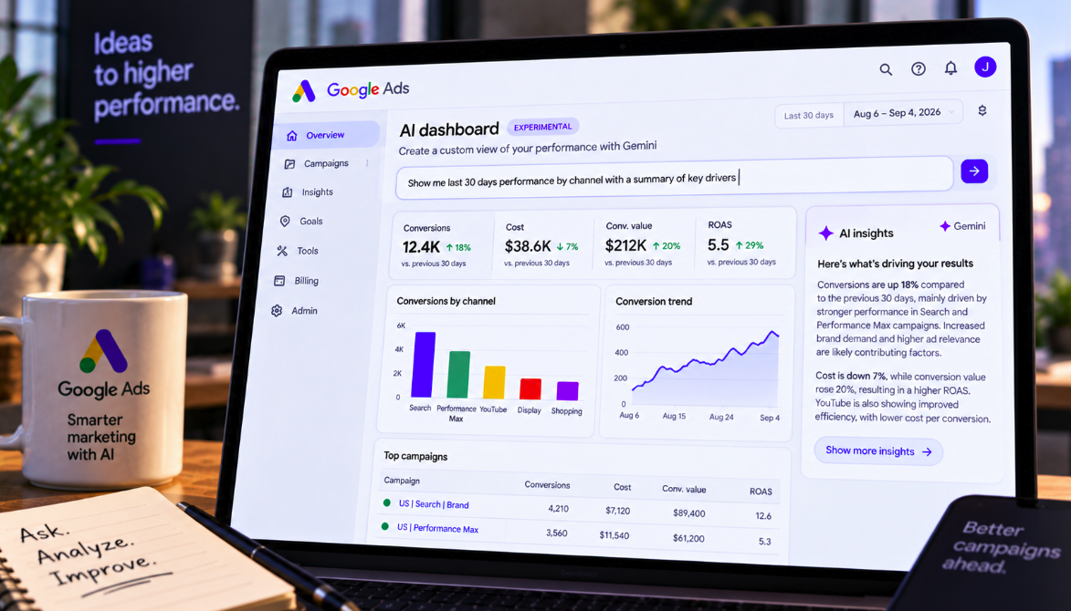
Google Ads is starting to turn campaign reporting into a conversation.
Gemini-powered AI dashboards are now appearing in some advertiser accounts, allowing marketers to describe the analysis they want in natural language and have Google build the visual report for them. The system does more than generate charts: it also produces a real-time summary that attempts to explain what may be driving the performance shown on screen.
The rollout was spotted in live accounts by Thomas Eccel and reported by Search Engine Roundtable on September 8. This is not an unannounced concept appearing from nowhere. Google previewed the Gemini-powered dashboard experience earlier this year and officially described the new reporting workflow in August, saying marketers would be able to transform raw data into visualizations with simple text prompts.
The more consequential part is the explanation layer. Google says every generated report can automatically include a real-time summary designed to explain the “why” behind the data.
That could dramatically reduce the time required to move from a performance question to a usable analysis. It also introduces a new analytical risk: an AI can produce a convincing explanation much faster than a marketer can prove that the explanation is actually causal.
A prompt can now become a dashboard
Traditional Google Ads reporting requires marketers to decide which metrics, dimensions, date ranges, filters and visualizations they need before building the report. Experienced PPC analysts can do this quickly, but the process still requires familiarity with the reporting interface and a clear idea of how to structure the analysis.
The new dashboard experience changes the starting point.
Instead of manually assembling a chart, an advertiser can ask for something closer to the business question itself: show performance over the last 30 days by channel, compare conversion value and cost, or identify which campaigns changed most significantly.
Gemini then converts that request into a visual report.
This shifts part of the reporting skill from interface construction to analytical prompting. The marketer still needs to know what question matters, but no longer needs to translate every question manually into a dashboard configuration before seeing the data.
Google says the dashboard also explains the “why”
Chart generation is useful, but Google is positioning the explanatory summary as a larger step forward.
In its August announcement, Google said each report automatically generates a real-time summary explaining the “why” behind the data. Search Engine Roundtable’s report on the live rollout similarly describes a dashboard that creates a visual report from account data and then supplies an AI-generated interpretation of the performance.
For example, a marketer might ask why conversions increased while cost declined. Instead of simply displaying those two trends, the system can attempt to identify campaign, channel or other account-level changes associated with the movement.
That turns the dashboard from a visualization tool into an analytical assistant.
It is also where human judgment becomes most important.
An AI explanation is not the same as causal proof
Marketing data contains many correlated events.
A Performance Max campaign may increase spend at the same time branded search demand rises. Conversion rate may improve while a promotion is running. Cost per acquisition may decline after a bidding change while seasonality is simultaneously increasing demand.
An AI system can identify those patterns and describe plausible relationships. That does not automatically prove which event caused the result.
If Gemini says stronger Search performance “drove” an account-wide increase in conversions, the statement should be treated as an analytical interpretation unless the underlying evidence supports a causal conclusion.
Controlled experiments, incrementality analysis and careful segmentation remain necessary when the business decision depends on causation rather than correlation.
The speed of AI reporting makes this distinction more important, not less. A persuasive narrative can now appear immediately beside the chart.
Google has been moving toward natural-language reporting for some time
The new dashboards build on a broader transition already underway inside Google Ads.
Google’s official Report Generator documentation says advertisers can use natural-language prompts to create detailed campaign reports with Google AI. The Report Generator considers more than 500 Google Ads metrics and can respond to questions such as which Search campaigns had the highest conversion rates or where performance is declining.
Users can also request changes to existing reports, including adding or removing columns and filters, changing date ranges and undoing previous report modifications.
The new Dashboard experience takes that prompt-driven reporting model and makes visualization plus interpretation more central to the workflow.
Dashboards and Report Generator should not be treated as identical features
There is overlap between the products, but they should not be collapsed into one feature.
The existing Report Generator is documented as an AI-assisted tool inside Report Editor for constructing and modifying reports. Google’s newer Dashboards announcement emphasizes a unified visual reporting experience where prompts transform raw data into charts and every report receives a real-time explanatory summary.
Both reduce the need for manual report construction, and both use Google AI. The newer dashboard experience goes further toward making the analysis itself conversational.
That distinction matters for advertisers who already have access to prompt-based Report Generator functionality but do not yet see the newer AI dashboards described in the September rollout reports.
The feature is appearing in some accounts, not necessarily every account
Search Engine Roundtable reports that the dashboards are live in some Google Ads accounts, based on Eccel’s observations.
Google’s August announcement described the broader AI reporting tools as a beta available for English-language accounts. That means availability should not be assumed across every advertiser, language or account configuration.
Google frequently stages Ads features gradually, and individual accounts can receive interfaces at different times.
An advertiser who does not see the new dashboard today should therefore not assume there is an account problem.
The biggest productivity gain may be exploratory analysis
One of the hardest parts of performance analysis is not building the final executive dashboard. It is the series of exploratory reports required before the analyst knows what happened.
A marketer notices that ROAS fell. They segment by campaign type. Then by device. Then by geography. Then by week. They compare conversion rates, average CPC, conversion value and impression share. Each step creates another question.
Natural-language reporting can shorten that loop.
Instead of repeatedly rebuilding tables, an analyst can ask follow-up questions and request new visualizations. The value is not simply that the first report is faster; the entire investigative path can become more fluid.
That could make sophisticated account exploration accessible to marketers who know their business well but are less experienced with Google Ads reporting interfaces.
The skill shifts from building charts to asking better questions
Automation does not eliminate analytical skill. It changes where that skill is applied.
If almost anyone can type “show me why conversions fell,” the competitive advantage moves toward knowing whether that is the right question, which date range is meaningful, which segments need to be isolated and which alternative explanations should be tested.
A vague prompt can still produce a polished but shallow answer.
Google’s Report Generator documentation explicitly recommends specific prompts, including relevant date ranges and the metrics advertisers want to analyze. The company warns that prompts can fail when they are too vague or contain conflicting instructions.
Good analysis therefore still begins with good problem definition.
AI-generated summaries could accelerate executive reporting
The feature may also change how agencies and in-house teams communicate performance to non-specialists.
A dashboard traditionally needs interpretation before it becomes useful to an executive. A chart showing a 20% increase in conversion value does not explain whether the improvement came from higher demand, better efficiency, more budget or a change in campaign mix.
An automatically generated narrative can provide an immediate first-pass explanation.
That could reduce the time analysts spend writing repetitive weekly summaries and free them to focus on anomalies, strategy and validation.
But the final narrative should still be reviewed before it is sent to a client or leadership team. AI-generated confidence is not a substitute for analyst accountability.
Agencies will need to decide where human review is mandatory
For agencies, the new dashboards create a governance question.
If Gemini can build a chart and explain the result in seconds, it becomes tempting to copy that explanation directly into a client report. That is efficient until the model overlooks a promotion, tracking change, offline event or business context that is not obvious in the Google Ads dataset.
Agencies may need a simple rule: AI can generate the first analytical hypothesis, but a human signs off on claims about why performance changed.
The higher the financial consequence of the recommendation, the stronger that validation should be.
A suggestion to investigate one campaign is different from a recommendation to move hundreds of thousands of dollars in budget.
Google Ads is becoming an interpretation layer over its own data
The strategic shift extends beyond dashboards.
Google has been building Gemini across campaign creation, optimization, creative generation and measurement. Its 2026 marketing announcements increasingly position AI not merely as an automation engine running campaigns but as an interface through which advertisers understand and manage those campaigns.
That creates a circular workflow: Google operates much of the advertising system, measures the results, visualizes those results and increasingly provides the AI explanation of what happened.
This can be enormously convenient. It also makes independent measurement more important.
Advertisers should continue comparing platform-reported performance with analytics, CRM data, ecommerce revenue and business outcomes where appropriate. A platform’s interpretation of its own data is useful evidence, not the only possible view of performance.
Prompt-based reporting can democratize analysis without eliminating expertise
The strongest argument for the new dashboards is accessibility.
Many small businesses and marketing generalists have valuable Google Ads data but lack the time or technical reporting expertise to extract useful patterns from it. A natural-language interface lowers that barrier.
A business owner does not need to know the exact reporting dimension required to ask which campaigns produced the most conversion value last month. The AI can translate the business question into the report structure.
Experts still retain an advantage because they know which questions expose misleading averages, attribution problems and hidden trade-offs.
AI makes report construction easier. It does not make every interpretation equally good.
The real-time “why” could become the most influential part of the dashboard
Charts appear objective because they visualize recorded metrics. Explanations are different: they choose which relationships deserve attention.
If Google’s AI summary tells an advertiser that conversions improved primarily because of one campaign type, that statement can shape the next budget decision even when several other explanations are possible.
The explanatory layer may therefore become more influential than the visualization layer.
Advertisers should learn to inspect the underlying data supporting each AI conclusion and ask follow-up questions rather than accepting the first narrative as definitive.
The best use of the feature may be conversational skepticism: ask Gemini what changed, then ask what evidence supports the explanation, which segments contradict it and what alternative causes should be considered.
Google Ads reporting is moving from interface expertise to analytical dialogue
The arrival of AI dashboards in live accounts marks another step toward a Google Ads interface where marketers increasingly express intent in natural language and let Gemini handle the mechanical work.
A prompt can become a chart. The chart can become an explanation. A follow-up can become another analysis.
That can save substantial time and make account data easier to explore, especially for advertisers who previously depended on manually constructed reports.
But the most valuable part of performance analysis has never been drawing the graph. It is deciding what the graph means and what action the evidence justifies.
Gemini can now help with both. Marketers should welcome the first capability and interrogate the second.
Google Ads is making dashboards dramatically easier to build. The next challenge is ensuring that an instant explanation does not become an instant assumption.